What Color Should I Paint It? If you've asked this question - don't worry you are not alone! This is probably the MOST common question asked in painting classes - especially technique classes for blending colors
Colors that look good together are called a color harmony. Artists and designers use these to create a particular look or feel.
Whether you are using your favorite brand of paint or perhaps Posh Chalk metallic pastes (shameless plug) the color combinations are pretty much endless.
Read on to find out how to choose your perfect color combination.
Let's start with those of you who are looking for colors to use with your decoupage
(because let's face it - it's what we love to do)
Step #1 - Take a close look at the paper you've chosen.
(If you're not decoupaging - no worries - we'll be back with you in just a paragraph or so)
Go ahead - get your paper out and put it on the table in front of you.
Step #2 - Ask yourself these 2 questions:
What colors jump out at you when you look at your decoupage paper?
What's your vibe?
You may have favorite colors. You may be thinking of your living room colors. But what you see first will probably be your color scheme. Go with your gut.....
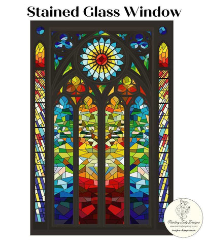
For example - take a look at our Stained Glass Window Paper
Do you see red/orange/yellow ? Or do you see blue/green ?
*There is no right or wrong answer*
The point is that what you see first is what draws you in
Now take another look at your own decoupage paper.
(If you don't have one of your own yet - we'll talk......)
The paper you chose caught your eye for a reason - most probably a color combo - so think about why you chose it.
That color combo that caught your eye is most probably your vibe.
Go with it!
If you're in one of my classes - the next thing you'll see me do is whip out a color wheel. Now you may not have seen one of these since middle school art class but believe me
THEY STILL WORK!
But what do you do with this thing?
I promise - no art theory classes needed!
There are 2 basic concepts that will get you started in no time at all.
-
You can choose colors NEXT to each other (e.g. red orange yellow) This option will work best if you are a newbie to color blending
-
You can choose colors ACROSS from each other (e.g. teal orange) This option is called using complementary colors and this is the option to choose if you want your project to POP!
The amazing Kelly Huskins, founder of Eye Love Hue paint company has written a wonderful piece on using complementary paint colors AND gives specific examples of complementary paint colors in her line. Just click the picture below to read what she has to say.
Just to give you a couple more examples: This is a fabulous example of using colors that are NEXT to each other or Analogous. Together, they look aesthetically pleasing and produce a calming effect. This is the Painting Lady Designs paper Meet Me at the Sea by our Resident Artist Tanglewood Sue.
This Copper Patina Decoupage Paper is a great example of using colors ACROSS the color wheel from each other or COMPLEMENTARY colors. Notice the intense "pop" of the contrast between the teal and rusty orange? If you think about those "scroll stopper" pictures you see on Facebook and Instagram - that intense pop of color contrast might be the reason it caught your eye!
And so we come to the end of our WHAT COLOR SHALL WE PAINT IT? blog
If you've stayed with me this long - THANK YOU!!
For a FREE download of a color wheel for you to keep handy in your work area - just visit the FILES section of our Facebook group.
(Feel free to join us while you're there!)
We'd LOVE to have you come and browse our wonderful designs at PAINTING LADY DESIGNS.
We're sure you'll find a paper with colors that match your vibe!
When you do - you can use the coupon code EMAIL10 at checkout for 10% off all products on our website!
Be sure to sign up for our newsletter too!
Happy Decoupaging, Designing and Decorating to you all!!!
Tracy Sayers Trombetta
Owner, Painting Lady Designs


